In the bustling world of consumerism, where products jostle for attention on crowded shelves and digital storefronts, packaging plays a pivotal role. A box isn’t just a container; it’s a canvas upon which marketers paint their brand identity, messaging, and values. But beyond its functional purpose, packaging wields a profound psychological influence on consumer behavior. In this exploration, we delve into the fascinating realm of box printing, uncovering how color and design intricately shape the decisions consumers make.
Developing a Perception of Perception
Before delving into the nuances of color and design, it’s essential to grasp the foundational principle of perception. Human beings are inherently visual creatures, with sight being one of our primary senses. Our brains are wired to process visual stimuli rapidly, often making split-second judgments based on what we see. This phenomenon extends to the realm of consumer goods, where packaging serves as the first point of contact between a product and a potential buyer.
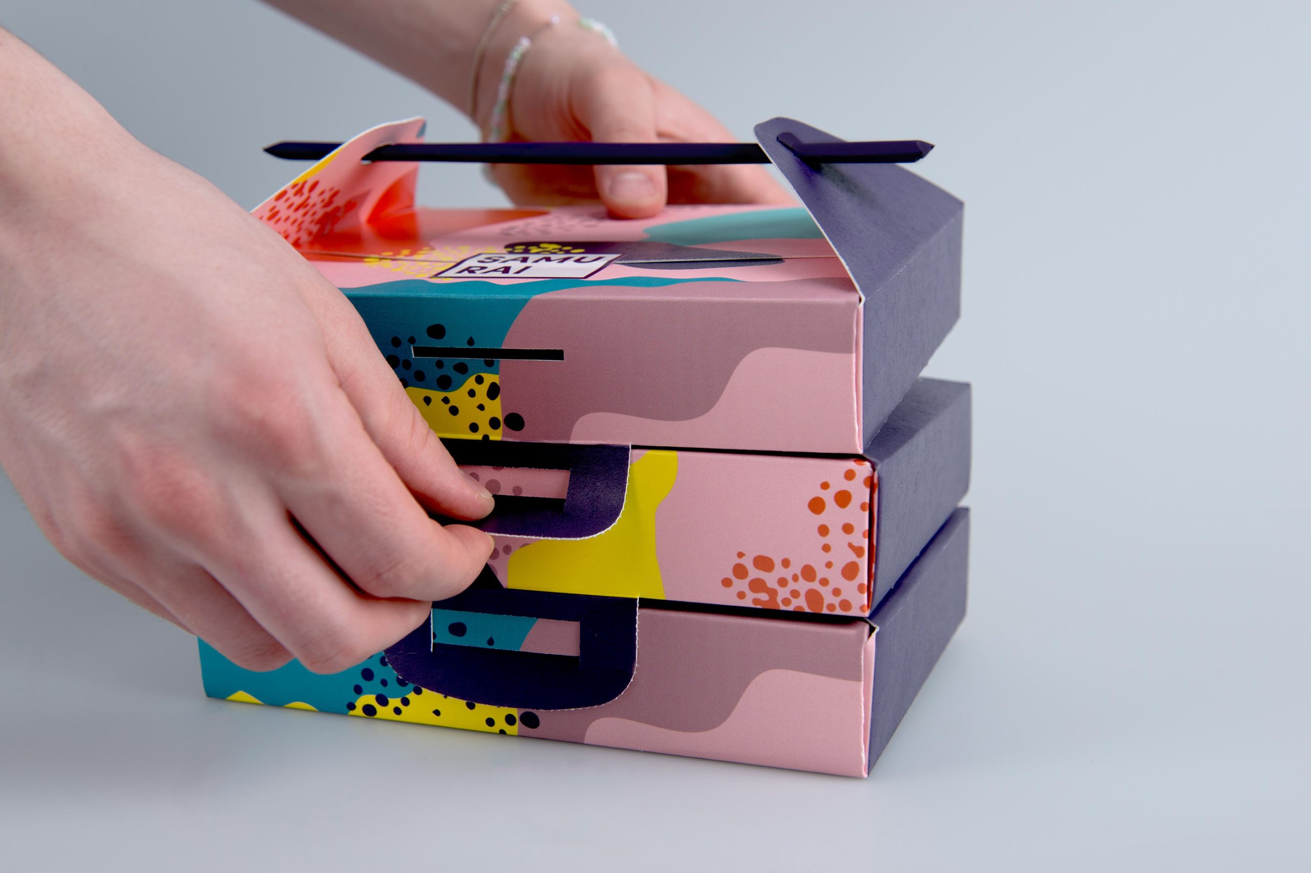
When a consumer encounters a product on a shelf or online, their first impression is significantly impacted by the packaging. The colors, fonts, imagery, and overall design convey subtle yet compelling messages that can stir emotions, mold perceptions, and ultimately influence buying choices. In this context, printing on paperboard packaging emerges as a strategic means for brands to articulate their identity and engage with their intended audience on a visceral level.
The Language of Color
Color is perhaps the most potent element of box printing, capable of eliciting a spectrum of emotions and associations. Different hues evoke different psychological responses, tapping into deep-seated cultural, biological, and personal associations. Let’s explore some common colors and their psychological effects:
Red:
Bold, passionate, and attention-grabbing, red is often associated with energy, excitement, and urgency. It stimulates the senses and can create a sense of urgency, making it ideal for products targeting impulse buyers or those seeking a vibrant, dynamic experience.
Blue:
Tranquil, trustworthy, and calming, blue exudes a sense of reliability and professionalism. It’s often used by brands to convey stability, security, and competence, making it popular in industries such as finance, healthcare, and technology.
Green:
Symbolizing nature, growth, and harmony, green appeals to eco-conscious consumers and those seeking products aligned with sustainability values. It can evoke feelings of freshness, vitality, and renewal, making it a popular choice for organic or environmentally friendly products.
Yellow:
Bright, cheerful, and optimistic, yellow radiates warmth and positivity. It grabs attention and can create a sense of happiness or playfulness, making it suitable for products targeting children or those associated with fun and creativity.
Black:
Sleek, sophisticated, and authoritative, black exudes a sense of luxury and exclusivity. It’s often used by high-end brands to convey elegance, power, and prestige, eliciting feelings of sophistication and refinement.
White:
Clean, pure, and minimalist, white signifies simplicity and clarity. It’s commonly associated with purity, innocence, and neutrality, making it a versatile choice for a wide range of products, particularly those emphasizing cleanliness or modernity.
The Art of Design
Beyond color, the design elements of box printing play a pivotal role in capturing attention and conveying brand messaging. Typography, imagery, layout, and texture all contribute to the overall visual impact of packaging. Here’s how these design elements influence consumer behavior:
Typography:
The choice of fonts can convey a brand’s personality, whether it’s playful and whimsical or sleek and professional. Bold, easy-to-read fonts are essential for ensuring that key information such as product names and benefits are conveyed effectively.
Imagery:
Images and graphics can evoke emotions, tell a story, or showcase product features. High-quality photography or illustrations that resonate with the target audience can create a strong emotional connection and enhance brand recall.
Layout:
The arrangement of elements on a box can guide the viewer’s eye and emphasize key messages or calls to action. A well-balanced layout ensures that important information is prominently displayed without overwhelming the consumer.
Texture:
The tactile experience of packaging can influence perception and create a sense of quality or luxury. Embossed logos, matte finishes, or textured surfaces can elevate the perceived value of a product and enhance the overall brand experience.
Conclusion: Harnessing the Power of Box Printing
In conclusion, the psychology of box printing is a multifaceted phenomenon that blends art and science to influence consumer behavior. By understanding the psychological impact of color and design, brands can create packaging that resonates with their target audience, elicits emotional responses, and drives purchasing decisions.
In today’s competitive marketplace, where consumers are inundated with choices, effective box printing is not just about containing a product—it’s about creating a connection, telling a story, and leaving a lasting impression. By harnessing the psychology of color and design, brands can elevate their packaging from mere containers to powerful marketing tools that shape perceptions, influence behavior, and drive success in the marketplace.